
The brief
Hudson Conway has looked after the numbers of businesses and individuals in Cheltenham since 2005. The firm is small on purpose: the person who answers your email knows your name, your business and the question you asked last time.
The website had to say that plainly. It needed to explain the work, introduce Angela Munn, the director, and make a first conversation feel like the obvious next step rather than a commitment. No stock photography and no assumption that a visitor already understands their own accounts.
What it does
Four pages, each with one job.
- Home. What the firm does, how it works and who will read the email, with a clear route to a free chat.
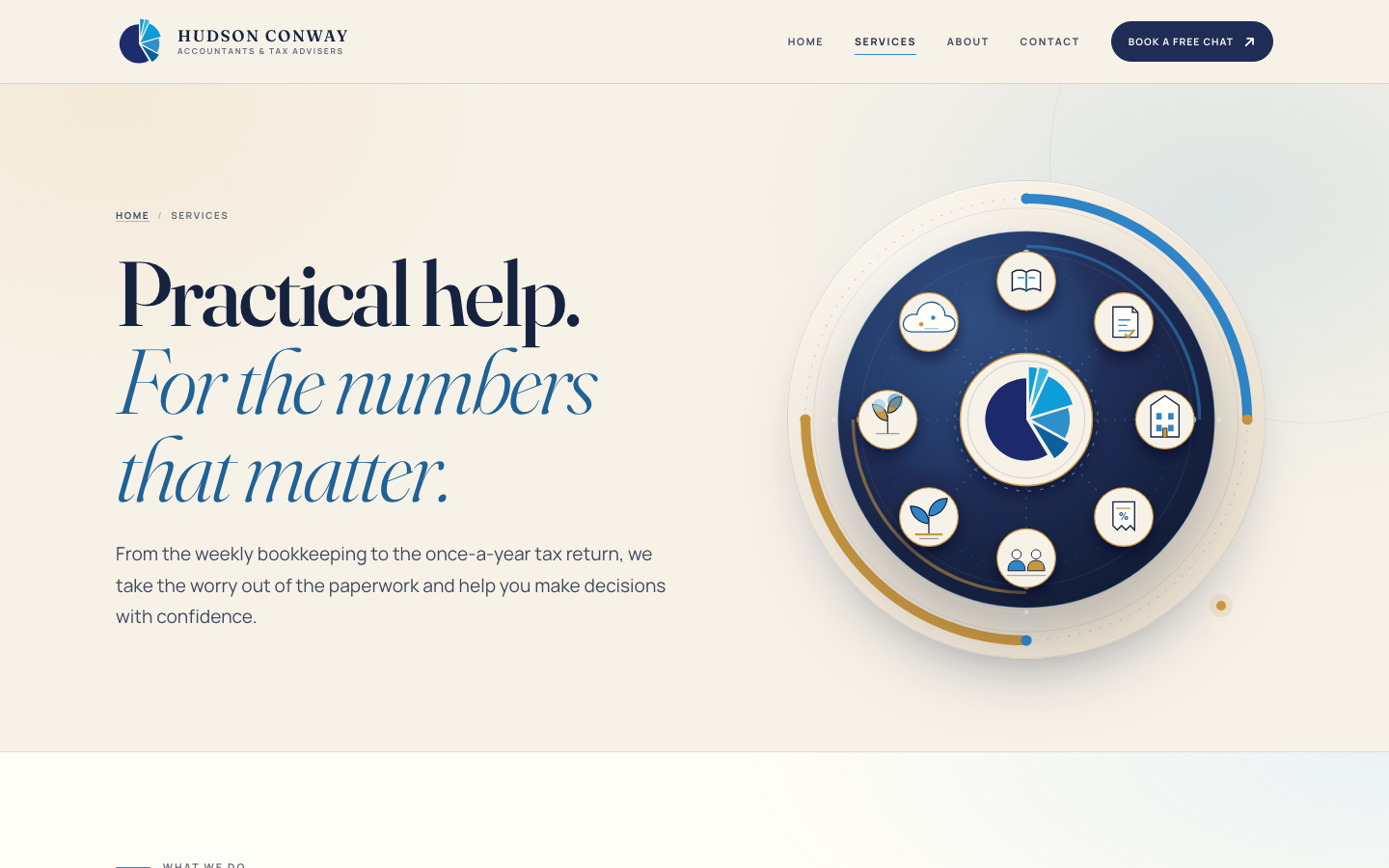
- Services. Accounts and bookkeeping, tax returns and planning, limited companies, VAT, payroll, business start-ups, inheritance tax and estates, and cloud accounting, each explained in plain English.
- About. The firm's history and Angela's qualifications - what PhD, CTA and MAAT actually mean, and why they matter to a client.
- Contact. The details to get in touch and a short form for anyone who would rather type than call.
The direction
The site has to feel precise without feeling corporate. Navy and blue carry the firm's identity; a high-contrast serif gives the headlines weight, and a calm sans-serif keeps the body easy to read.
The circular charts are the repeated idea: numbers arranged into something a person can understand at a glance. They sit beside the words rather than decorating them, and the small line drawings on the services page do the same job for each service. The result looks like an accountant's work - ordered, careful and not afraid of a little colour.
What it is
A small site for a small firm. Four pages, one clear route to a free conversation, and enough room for the people behind the business to sound like themselves.